From Emails to Insights: Unlocking the Power of A/B Testing
Imagine you’re part of a fast-growing SaaS company, and your job is to help turn free users into paying customers. The marketing team has a powerful tool at their disposal: email campaigns. But with thousands of emails sent daily, how do you know which ones actually work? That’s where I came in, armed with data, curiosity, and a mission to find the perfect email recipe. This is the story of how I used A/B testing to uncover what makes users open, click, and convert—and how it taught me the art of turning data into decisions.
The Challenge: Making Emails Irresistible
Our company’s freemium productivity tool had a huge user base, but converting free users to paid plans was tough. The marketing team was sending emails with different designs—some with bold visuals, others with detailed text—but they weren’t sure which worked best. They also wondered if sending emails in the morning or evening made a difference, or if certain users were more likely to engage. My task was to analyze a massive dataset of 500,000 email interactions to find answers. The goal? Design an A/B test to compare three email versions (let’s call them A, B, and C) and figure out which one drove the most opens, clicks, and paid subscriptions.
Step 1: Cleaning the Messy Data
Before diving into the fun stuff, I had to deal with a messy dataset. Imagine a giant spreadsheet with missing entries, duplicate rows, and inconsistent formats—it’s like trying to cook with a cluttered kitchen. I rolled up my sleeves and got to work:
- Fixed Missing Data: Some users’ account ages and activity levels were blank. I filled these with average values to keep things fair, and marked unknown user types as “unknown.”
- Removed Duplicates: Found 15,000 duplicate emails (about 3% of the data) and deleted them to avoid skewed results.
- Set the Stage: Made sure every column, like timestamps and open/click statuses, was in the right format for analysis.
By the end, I had a clean dataset of ~485,000 records, ready to reveal its secrets.
Step 2: Exploring the Data
With clean data in hand, I started exploring to understand what was going on. This part felt like being a detective, searching for clues in user behavior. I used Python and tools like Plotly and Seaborn to create charts and tables, asking questions like: When do users open emails? Which email design grabs attention? Who’s engaging the most?
Here’s what I found:
- The Morning Advantage: Emails sent in the morning had a 27.7% open rate, beating afternoon (27.3%) and evening (23.0%). People are more likely to check emails with their morning coffee!
- Active Users Shine: Users already active in the app opened 27.2% of emails, while inactive users lagged at 18.5%. New users were in the middle at 25.8%.
- Visuals Win (Slightly): Emails with bold images had a 25.9% open rate, just edging out balanced (25.7%) and text-heavy (25.6%) designs.
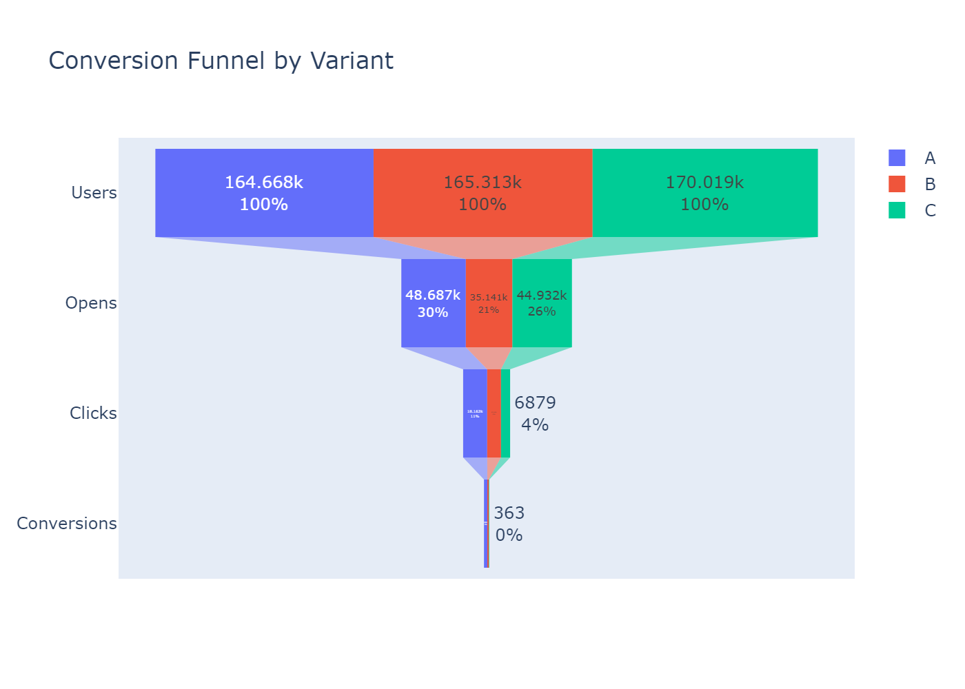
- Variant A Stands Out: Email Variant A had a 29.6% open rate, compared to 21.3% for B and 26.4% for C. It also led in clicks (37.3%) and conversions (1.5%).
I created funnel charts to show how users moved from opening to clicking to subscribing, and heatmaps to spot patterns, like Variant A performing best in morning sends. These insights set the stage for the A/B test.
Step 3: The A/B Test
Now came the exciting part: testing whether Variant A was truly the champion. A/B testing is like a science experiment—you compare different versions to see which performs better, using math to ensure the results are trustworthy. I used statistical tests (like Z-tests) to compare open rates, clicks, and conversions, and even fancy methods like survival analysis to check how quickly users opened emails.
The results were clear:
- Variant A Rules: It had an 8.3% higher open rate than Variant B and 3.1% higher than Variant C, with super low p-values (meaning the differences were real, not random).
- Morning Boost: Variant A shone brightest in morning sends, hitting 33.5% open rates.
- Active Users Love It: Active users responded best to Variant A, especially with visual-heavy designs.
- Faster Opens: Survival analysis showed Variant A users opened emails faster than those receiving B or C.
To make sure I wasn’t missing anything, I used propensity score matching to account for differences in user types, and post-hoc tests to check performance across user groups and devices. Variant A consistently came out on top.
The Impact: From Data to Decisions
So, what did this mean for the marketing team? I recommended:
- Use Variant A: Its higher open and conversion rates make it the go-to email design.
- Send in the Morning: Morning emails get more opens, especially for Variant A.
- Target Active Users: Focus on engaged users, who are most likely to convert.
- Lean on Visuals: Visual-heavy designs slightly boost engagement.
These insights could help the team craft emails that get more clicks and paid subscriptions, boosting revenue for the SaaS company. For me, the project was a chance to flex my data skills—cleaning messy data, exploring patterns, and running rigorous tests—all while telling a story with numbers.
Lessons Learned
This project wasn’t just about emails; it was about problem-solving. I learned to handle huge datasets (500,000 rows is no joke!), use advanced stats like survival analysis, and make complex findings easy to understand. It also showed me the power of curiosity—every chart and test revealed something new about how people interact with emails.
What’s Next?
I’m not done yet! I’m working on turning my analysis into reusable Python scripts and a pipeline to automate the process, making it easier to analyze future campaigns. This project is a cornerstone of my portfolio, showing how I can turn raw data into real-world impact.
Want to dive into the details? Check out the full project on GitHub or reach out to me to talk data, emails, or SaaS growth!