📊 Client Acquisition, Retention & LTV Analysis
This project explores key business metrics—Customer Acquisition Cost (CAC), Client Retention, and Lifetime Value (LTV)—using simulated data to mimic a real-world customer lifecycle. It’s designed to demonstrate data analysis skills relevant for roles in marketing analytics, business intelligence, and customer lifecycle management.
✅ Built in Python using pandas, matplotlib, seaborn, and Plotly.
🔍 Objective
Analyze how marketing spend, acquisition channels, and customer behavior influence revenue outcomes and client value. This is especially aligned with roles involving:
- Customer retention and churn analysis
- Marketing performance evaluation
- LTV vs CAC strategy
- Monthly revenue tracking
📂 Datasets
The project uses three synthetic datasets:
campaigns.csv: Marketing spend by acquisition channelclients.csv: Client info including acquisition channel and signup datetransactions.csv: Transaction history per client
💡 Key Business Questions
- What is the Customer Acquisition Cost (CAC) by channel?
- How does Lifetime Value (LTV) vary across acquisition channels?
- What is the monthly client retention rate by signup cohort?
- How does revenue trend over time?
🧪 Analysis Overview
📉 Customer Acquisition Cost (CAC)
Calculated as:
CAC = Total Cost per Channel / Number of Clients Acquired
📌 Insight: Helps evaluate channel efficiency.
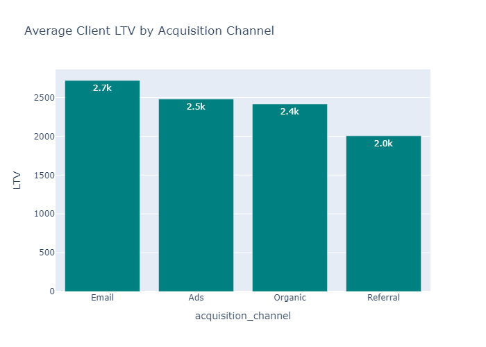
💰 Client Lifetime Value (LTV)
Total value of all transactions per client, merged with acquisition channel.
📌 Insight: Highlights the most profitable channels based on average LTV.
🔁 Retention Analysis
Built a retention matrix by comparing clients' transaction months to their signup month.
📌 Insight: Visualized with a heatmap to identify how long clients remain active.
📈 Monthly Revenue Trend
Tracked revenue over time by aggregating transaction values monthly.
📊 Visualizations
- CAC by Channel (Bar Chart – Plotly)
- Distribution of LTV (Histogram – Seaborn)
- Avg LTV by Channel (Bar Chart – Plotly)
- Client Retention Heatmap (Cohort Analysis – Seaborn)
- Monthly Revenue Trend (Line Chart – Plotly)
You can preview these visualizations directly in the notebook
🛠️ Tools & Technologies
- Python 3.10
- pandas, numpy
- seaborn, matplotlib, plotly.express
- Jupyter Notebook
📌 Results Summary
- Channel C had the lowest CAC and highest average LTV → Most efficient.
- Client retention dropped sharply after the first 2 months, indicating potential churn issues.
- Monthly revenue showed steady growth, likely driven by new acquisitions.
🧠 Skills Demonstrated
✅ Data Cleaning & Transformation
✅ Business Metrics Calculation (CAC, LTV)
✅ Cohort Retention Analysis
✅ Data Visualization
✅ Insight Communication for Business Impact